tbolt
Ditching Windows for Linux
I’ve ditched Windows 11 for Linux, specifically Ubuntu, and it’s been a relief. I dual-booted for years, but the benefits of having an always-on Linux machine outweigh the hassles of managing and using Windows. Linux on the desktop is in a great spot. The ecosystem is vibrant and it will only continue to blossom. If you’re into computers, I’d argue it’s the most fun option.
I don’t log into this machine directly very often since I still prefer MacOS for day-to-day use. But when I do, I don’t begrudge it like I did with Windows. I’m quite happy with Ubuntu and GNOME. Maybe that’s boring, but it does everything I need and is extremely stable.
Gaming still works well. Steam with Proton is excellent. Valve and the folks behind Wine/Proton have done incredible work. Steam Link makes it easy possible to stream games to other devices in the house, particularly Apple TVs. It’s actually worked better on Linux than it did on Windows. Even streaming non-Steam games has been smooth. I tested running Battle.net via Proton with Diablo IV and it worked like a charm, with zero fiddling or configuration as I recall.
For development work I still prefer MacOS and the Nova text editor. Nova has good SSH/SFTP support, so I can connect to my Linux box and work on projects remotely, and I often do. Agent forwarding with 1Password SSH Agent means I can still use my GitHub key from the Mac. It’s a nice setup.
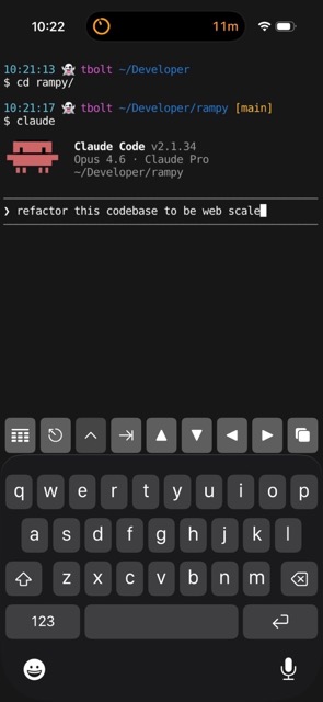
On iPhone and iPad I use Prompt for SSH. It’s a bit pricey and has a few bugs, but it’s otherwise a great app. Additionally, I can connect to my home network via VPN/WireGuard when I’m away. I’ve been experimenting with Claude Code this way, and it’s equal parts impressive and unnerving.

20 Years of Gmail
I don’t recall when I joined Gmail but my guess is summer 2004, shortly after it launched. I remember having to be relentless to get an invite. Looking back, I’m not sure why I felt such a strong need for one. I was a teenager and had no good use for email yet. I’m not even sure what I used for email before Gmail—probably AOL or Yahoo—but it didn’t matter, they were all garbage compared to Gmail.
Sometime around 2016 I started turning bearish towards Google. I stopped using Google Search and a number of other Google products. I also came pretty close to switching to FastMail. I never brought myself to do it, and I’m glad I didn’t switch. I like Gmail, and it’s always been a great service. I know there’s plenty of reasons why I shouldn’t use it, but to hell with those. Here’s to 20 more years.
Thoughts on Desktop Operating Systems in 2024
In the mid-to-late 90s I had my first encounters with computers. I remember playing Oregon Trail on an Apple II in elementary school, typing random letters and numbers on a friends MS-DOS machine to print out on a dot-matrix printer, and disassembling old broken PCs and HDDs for fun and a peek at the internals.
These memories feel more like a prologue to the real story of my computing journey though. First with Windows 95/98, then Mac OS 8/9. These GUI-based operating systems painted my worldview of computing. I wouldn’t learn much about Unix/Linux until years later. In college I distro-hopped between various Linux flavors but settled on Ubuntu for my personal machine(s). So that’s my perspective, 10+ years with Linux and 20+ years using Mac and Windows.
I think about Windows, MacOS, and Linux a lot and I’d like to document my thinking now, in 2024. I’m not trying to conclude which is best. They’re all strong in their own ways, and I like each of them for different reasons. Plus, things change. While MacOS has traditionally been my favorite, there were long stretches where I didn’t own a Mac and only used a Windows PC or a ThinkPad with Linux.
Windows
Shortly after Windows 11 was released I performed a clean install on a 12-Core Ryzen 5900x machine. The install process is fine but reminds you how much information Microsoft would like to collect. You can toggle a bunch of switches off but I doubt it does much. Once installed, you’ll be greeted by the offensive included apps. Half of them have ads, the other half are junk. Windows is a paid software, so having this default experience is disrespectful and puts a bad taste in my mouth.
Windows has one major thing going for it: it’s best-in-class for gaming. It might even be the greatest gaming platform of all time. Linux and even Mac are gaining ground, but they’ve got a little ways to go. I hope for something to dethrone Windows because the idea of a “Gaming PC” as nothing more than a console/appliance is depressing.
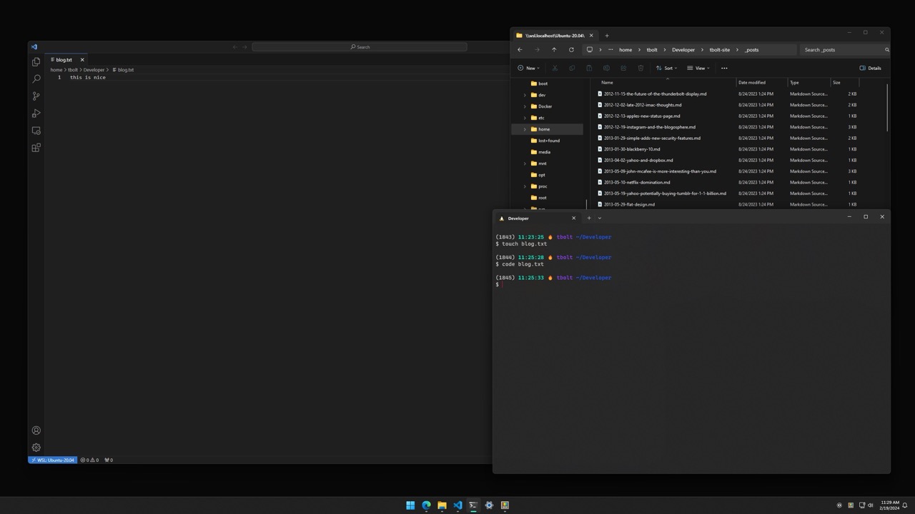
Software development, particularly web development, on Windows is pretty good now. Windows Subsystem for Linux (WSL/2), Windows Terminal, and VS Code make for a strong and complete environment. On a recent project it was easy to clone a repo in Terminal, run it in a docker container, and use VS Code’s Remote Development extension to edit directly in WSL or Docker Containers.
The visual design of Windows 11 is decent, and I like the direction it’s headed. It may be Microsoft finally appreciates UI Design and is developing some institutional taste. However, the worst apps i’ve ever used have all been on Windows. Every third-party app is a snowflake of UI Design. I’m not sure what Microsoft could have done differently, but it would be great to see native Windows apps held to a higher standard. Also, don’t dive too deep into controls or menus or you’ll end up in the 90s.

Other Thoughts
- Very stable lately; can’t recall a recent time the system has crashed.
- PowerToys is awesome.
- The damn ads and spyware hurt.
- Feels like I have to restart it once a week or more. Either due to updates or just old habit.
MacOS
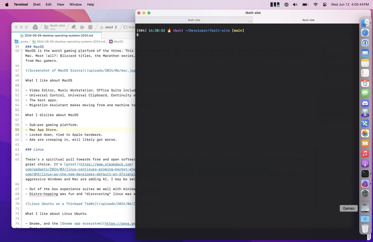
I’m writing this post on MacOS Sonoma, in the Nova text editor. Nova is one of the best pieces of software I’ve ever used. It’s refined and polished and there’s no equivalent on Linux and Windows. It has it’s own personality, but also feels like an extension of the operating system. Which is a hallmark of a great Mac app. Folks in the community call them Mac-assed Mac apps. These apps are what make MacOS really great. The best apps I have used are all Mac apps.
MacOS itself has best-in-class UI Design. There are some rough edges, News and System Settings come to mind, but overall it’s the most elegant and cohesive system. My favorite example of this is when you send an email with Mail.app. Pressing send plays a whoosh sound effect and it’s in stereo! Discovering these details over the years has been a delight, and it’s made me want to learn all the little spells the OS provides. As well, there are so many instances where I think I ought to be able to do something, and lo and behold, it works as expected.
Apple has historically been apathetic towards gaming, for whatever reason. This wasn’t always the case. In the late 90s and early 00s I had a ton of fun gaming on Mac. Most (all?) Blizzard titles, the Marathon series, and tons of great shareware and indie games. I’m still bitter Halo was rug-pulled from Mac. Apple seems to be more interested in gaming lately with their efforts in Game Porting Toolkit. I’m a bit jaded on Mac gaming though, and I think Apple did a fair amount of damage to the game dev industry with the App Store. That’s for another post though.
The Apple ecosystem and cross-product integration is amazing. Universal Control, Universal Clipboard, Continuity and so on feel like magic. I appreciate and use many of the integrations today but they create strong lock-in which doesn’t feel particularly good.

Other Thoughts
- Migration Assistant is underrated and makes moving from one machine to another really easy.
- Mac App Store isn’t great. It doesn’t allow upgrade pricing and is generally full of junk.
- Ads are creeping in, will likely get worse.
- Notes.app is brilliant and continues to get better and more capable.
Linux
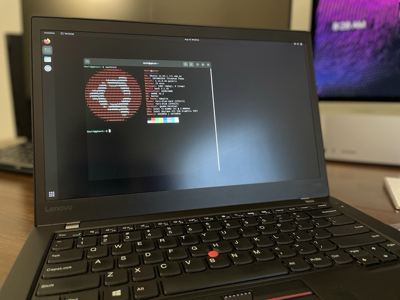
Years ago, I enjoyed trying out different Linux distros, window managers, and extensions. It was fun spending hours making it look like you could hack the Gibson. Nowadays, I’m less enthusiastic about tinkering and configuring systems. Fortunately, I’ve found that Ubuntu with GNOME offers a satisfying out-of-the-box experience. In fact, GNOME and its app ecosystem reminds me of MacOS quite a bit. Two thumbs up to the GNOME dev team.
I maintained a Ubuntu instance for close to 10 years on my HP N40L MicroServer. I loved that little machine and all the tinkering it afforded. Running anything but Linux on it would have felt weird.
Linux is top-notch for software development, and quickly becoming a compelling choice for gaming thanks to Valve’s Proton and the SteamDeck. I keep telling myself I’m going to switch my PC from Windows to Linux but it hasn’t happened yet (I’m not counting dual-booting).
It’s slowly gaining adoption which is great to see. The Windows hegemony may never be toppled but I’m rooting for Linux.

Other Thoughts
- There’s a spiritual pull towards Linux since it’s open source.
- Snap is a tragedy. I hate it. I will likely switch to Fedora due to it.
- Asahi Linux looks amazing.
There ya have it, my thoughts on modern desktop operating systems. Stay tuned for my thoughts on desktop operating systems in 2034.
Firefox Tabs Design
Over two years ago Firefox launched a new design with a change to how tabs look:
Inspired tab design: Floating tabs neatly contain information and offer cues only when you need them, like visual indicators for audio controls. The rounded design of the active tab signals the ability to easily grab and move tabs as needed.
I’m not sure what any of that means, or why traditional tabs can’t achieve those qualities. Either way I didn’t like the change then and I haven’t gotten over it since. They’re awful. They add nothing and make the browser UI look disjointed. Firefox is a great browser but damn those tabs.
AT&T Archives: The UNIX Operating System
From the video AT&T Archives: The UNIX Operating System (1982):
The usual way to get a large computer application developed involves a big team of people working in close coordination. Most of the time this works surprisingly well but it does have its problems and large projects tend to get done poorly. They take a long time and they consume an astonishing amount of money and in many cases the individual team members are dissatisfied. So everybody in the computing business is constantly searching for ways to do a better job of developing computer applications. There aren’t likely to be any final answers both because the problems are hard and because as we find solutions we try even more ambitious objectives.
What a prescient quote. This still holds true today.
Things a Computer Scientist Rarely Talks About
Occasionally I find myself down rabbit holes exploring the history of computing. Donald Knuth is often a name that comes up as his magnum opus The Art of Computer Programming is well known and revered in computer science and programmer circles. One such exploration led me to his talks on God and Computer Science. I haven’t listened yet, but I plan to as I find it a curious topic. I also enjoyed these lecture titles:
Why I am unqualified to give these lectures.
Why the lectures might be interesting anyway.
Thoughtful App Icons
I love good app icons. Others do too. They often reflect the quality of the software they represent. On MacOS, some of the best icons come from indie software developers. Whereas large companies frequently field uninspiring, flat, and dull icons. For example, compare an early version of the Docker for Mac Icon to the Postgres.app Icon. I dread launching Docker for Mac not least because of it’s low-quality app icon.
One of my favorite icons comes from Nord, a keyboard instrument maker. Their keyboards are a marvel of UI Design, playability, and sound engineering. To manage the sounds on the keyboard they offer a companion app, the “Nord Sound Manager.” The icon is beautiful and perfectly captures the essence of the hardware keyboards that it’s used with. A keyboard maker wouldn’t be my first guess as to where great app icons come from, but if you care about your products, every detail matters. Take a look-
Nord Sound Manager MacOS App Icon:
![]()
Nord Electro 6D Keyboard:
